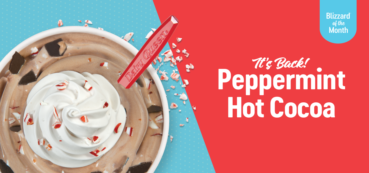
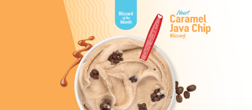
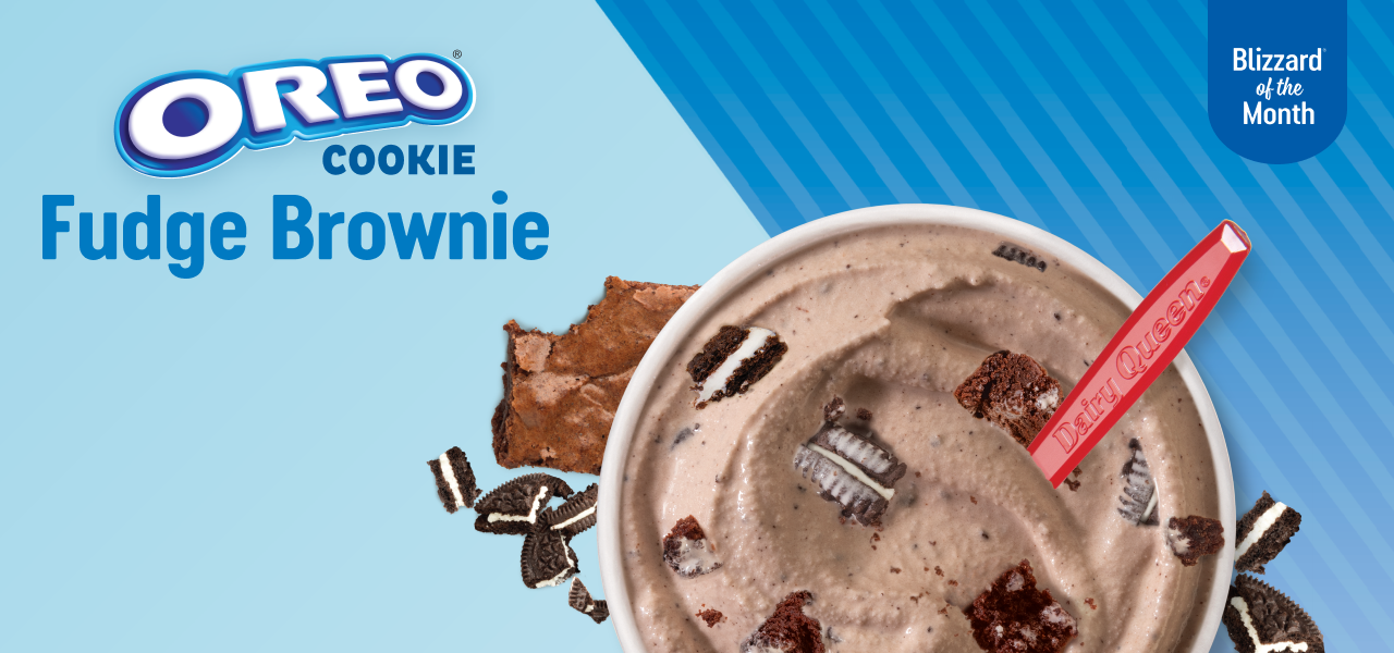
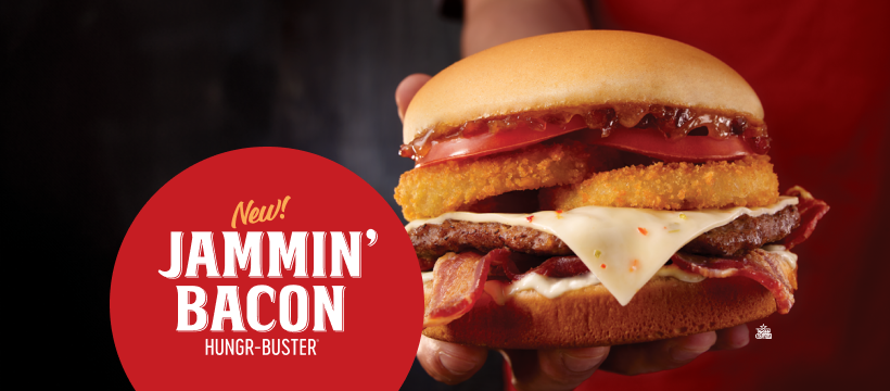
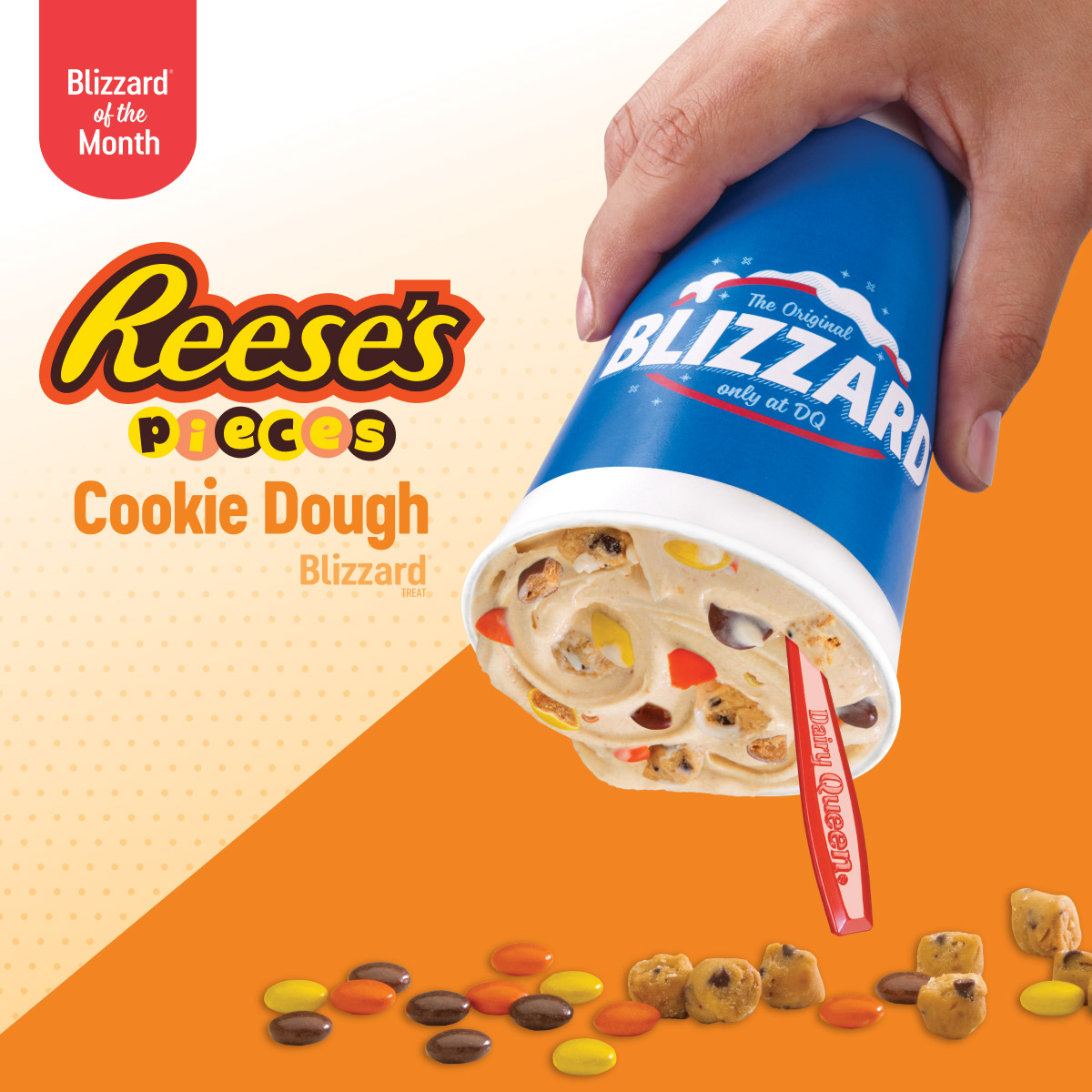
Texas Dairy Queen has monthly sets of assets that feature their limited time monthly Treats and Eats deals. This always includes a Blizzard of the Month and most of the time a food deal. What I love about this project is how it requires a balance between consistency and innovation. On one hand, the familiar structure of the Blizzard of the Month and food deals provides a steady foundation for the work. On the other hand, every month presents an opportunity to refine our approach and find new ways to captivate our audience. Whether it’s experimenting with bold typography, creative compositions, or fun seasonal touches, there’s always room for exploration within the established framework.
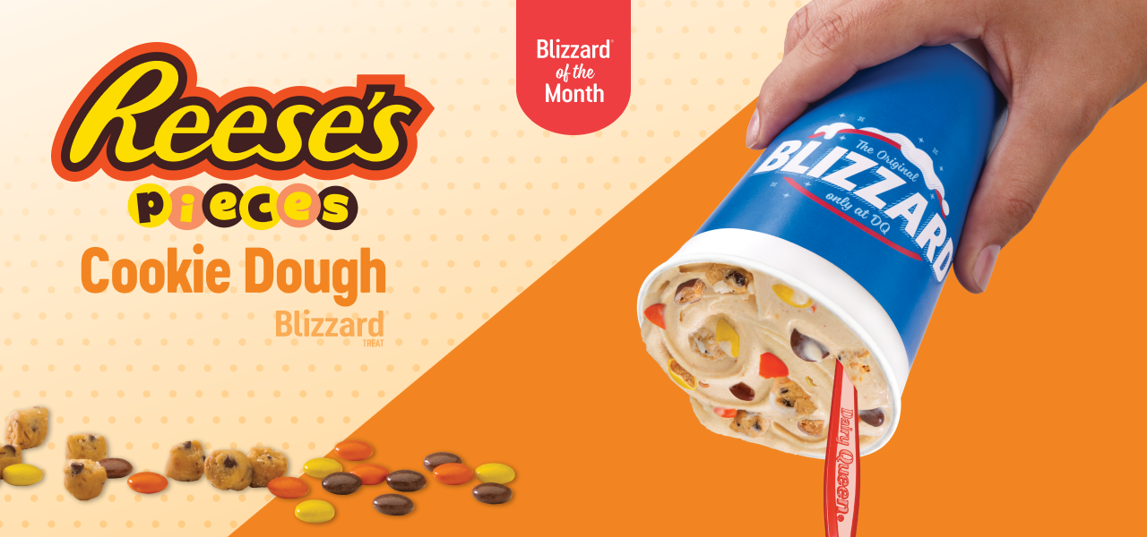
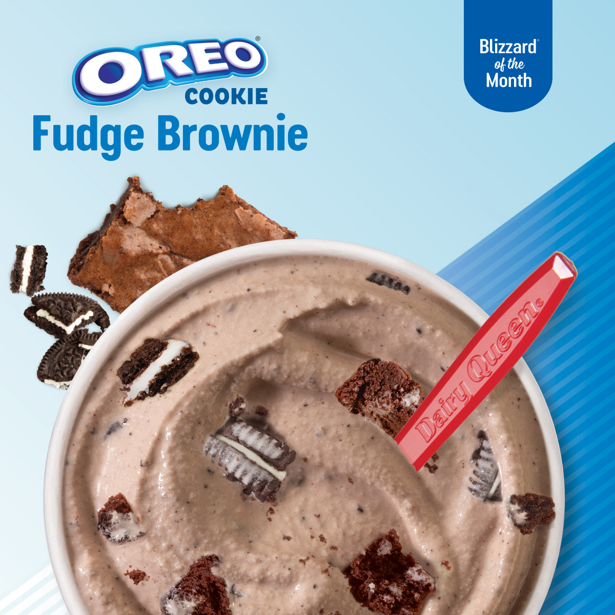
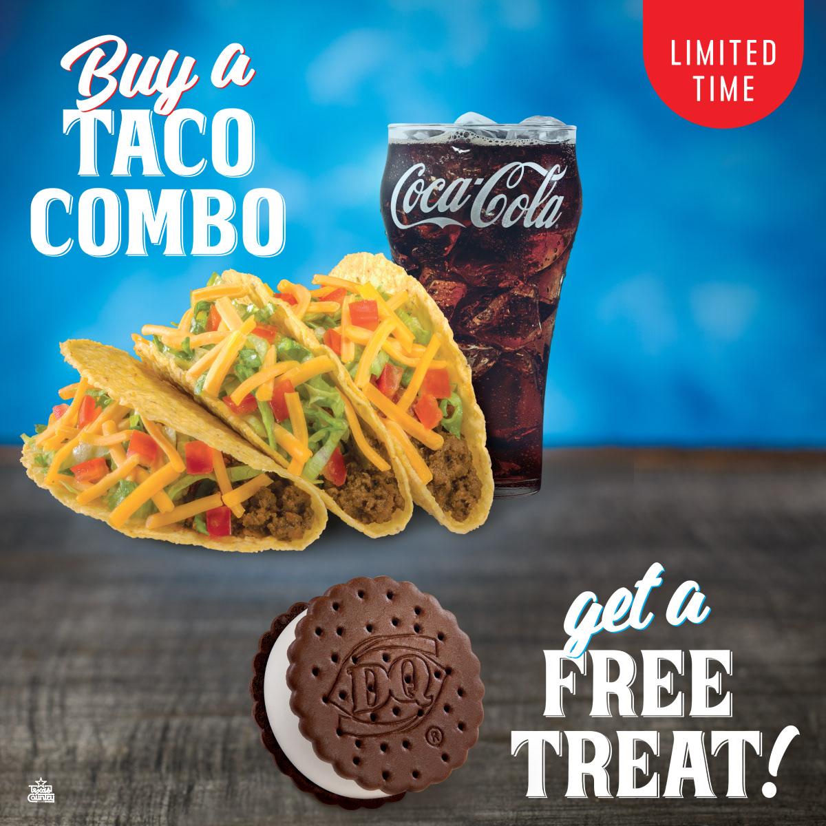
Working with Texas Dairy Queen has been an ongoing creative challenge, where I’m tasked with bringing a fresh perspective to campaigns that drive results. Each iteration allows me to push the boundaries of what’s possible while staying true to the brand's core identity and messaging.
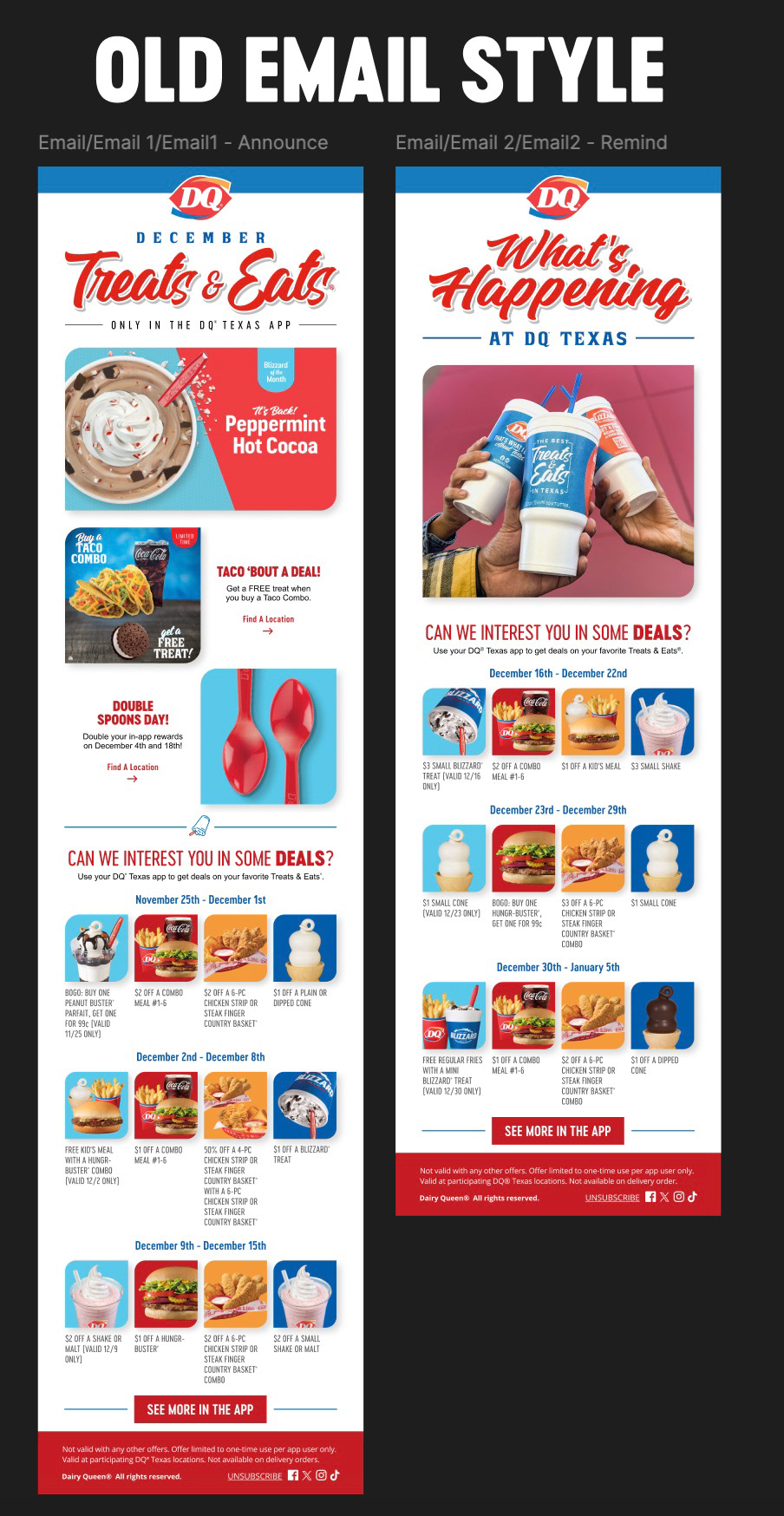
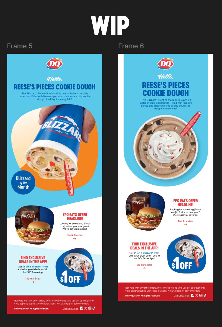
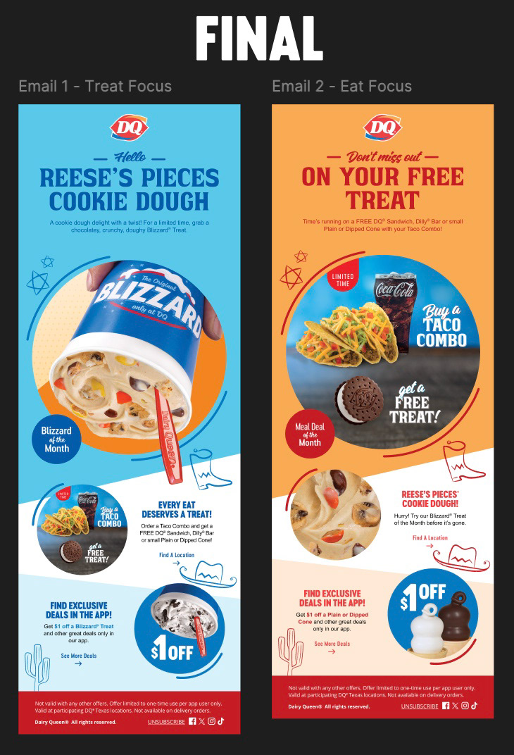
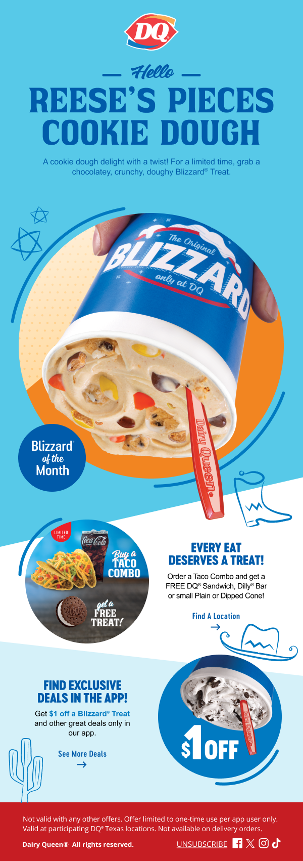
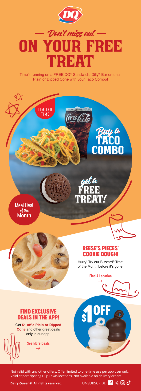
For early 2025, Texas Dairy Queen wanted to refresh their newsletter email design to better engage their audience and elevate the brand’s digital presence. I embraced the opportunity to dive into research, exploring current trends and analyzing what makes an email both visually appealing and effective in driving action. Through this process, I was able to experiment with layouts and refine the user experience to create something that felt fresh while staying true to the brand’s identity. Below, you can see a comparison of the previous versions, the process I followed, and the final design direction we landed on for the 2025 refresh. It was a rewarding project that allowed me to combine creativity with strategy.