The Training Center is a non-profit organization located in Marion Indiana. Their mission is to offer educational assistance to disadvantaged children to allow them to excel. Our initial thoughts was that the logo didn't accurately represent them, the name "Training Center" paired with their old logo made it seem like it was for athletics. We believed that we could give them a brand that was more true to themselves.
This is the old logo
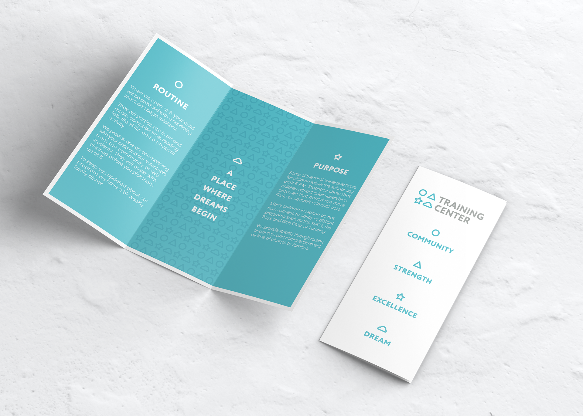
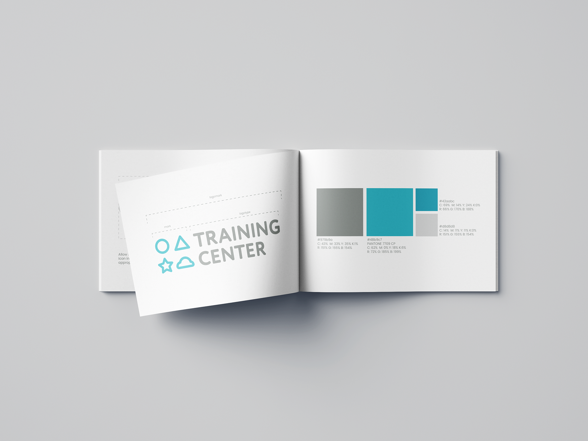
Their core values were to cultivate an environment that allowed the kids to develop community, strength, and excellence. Their tagline was "a place where dreams begin" and we really wanted to have that more prominent as well. We chose those four words, community, strength, excellence, and dream and made icons from them. Community is a circle because it surrounds us. Strength is a triangle because it is the strongest shape. Excellence is a star because it's used as an award. Dream is a cloud because of dream clouds used in cartoons. We felt like these together made a good mark, and eventually a pattern. The typeface we chose because it felt timeless and easy on the eyes. The color went through many variations but eventually we settled on a light blue which portrays trustworthiness and calmness. This created the final brand.

Brochure

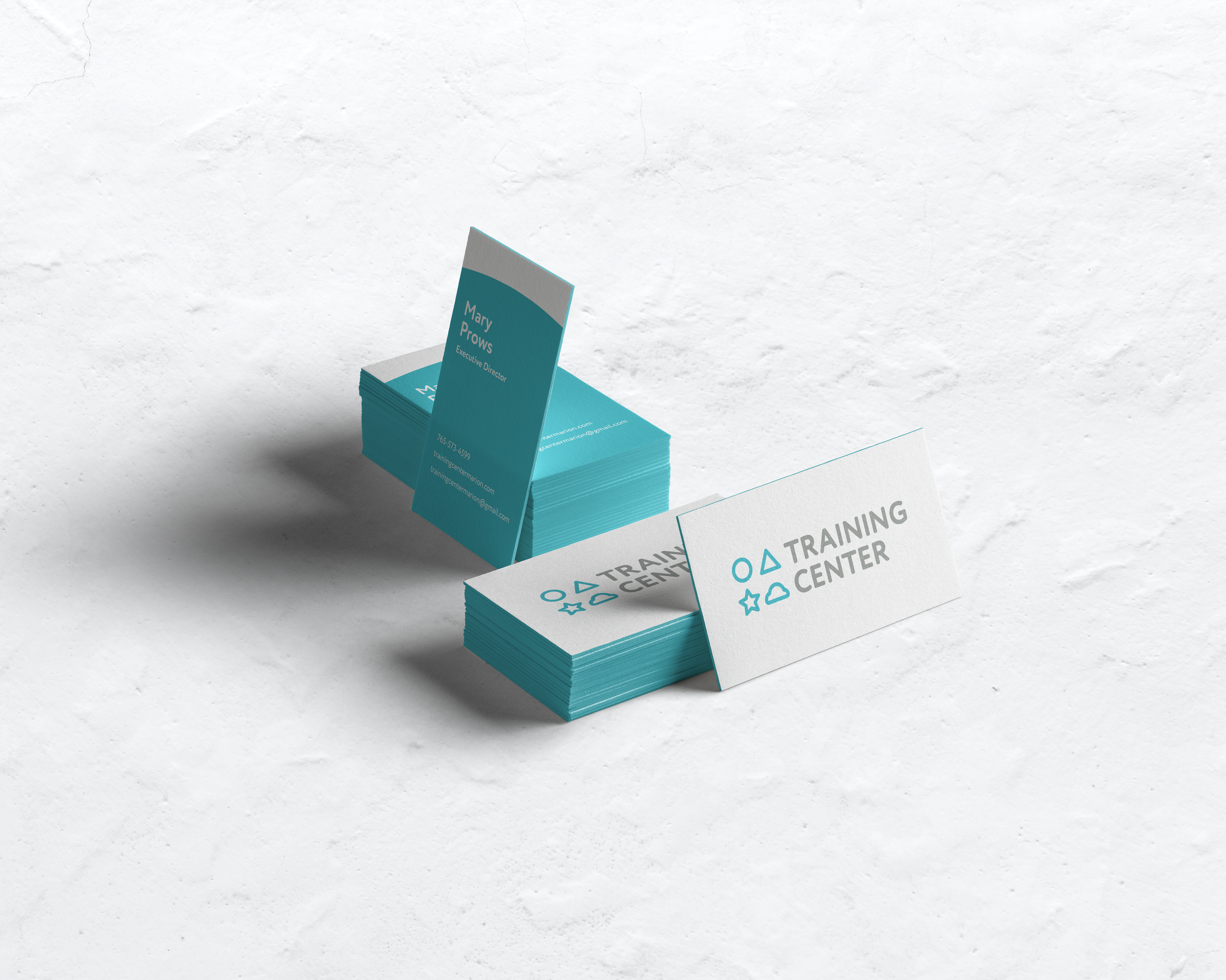
Business Cards

Brand Guideline Booklet

